Sara Herkenhoff Logo
  • Home
  • About
  • Studies
It's Me!

Welcome!

My name is Sara Herkenhoff, and I'm a graphic artist, a UX designer, and a casual musician with a love for the absurd. I take pride in my work, and take meticulous care in creating it. I often find myself musing about technology that doesn't exist yet, and how design evolves in this new frontier.

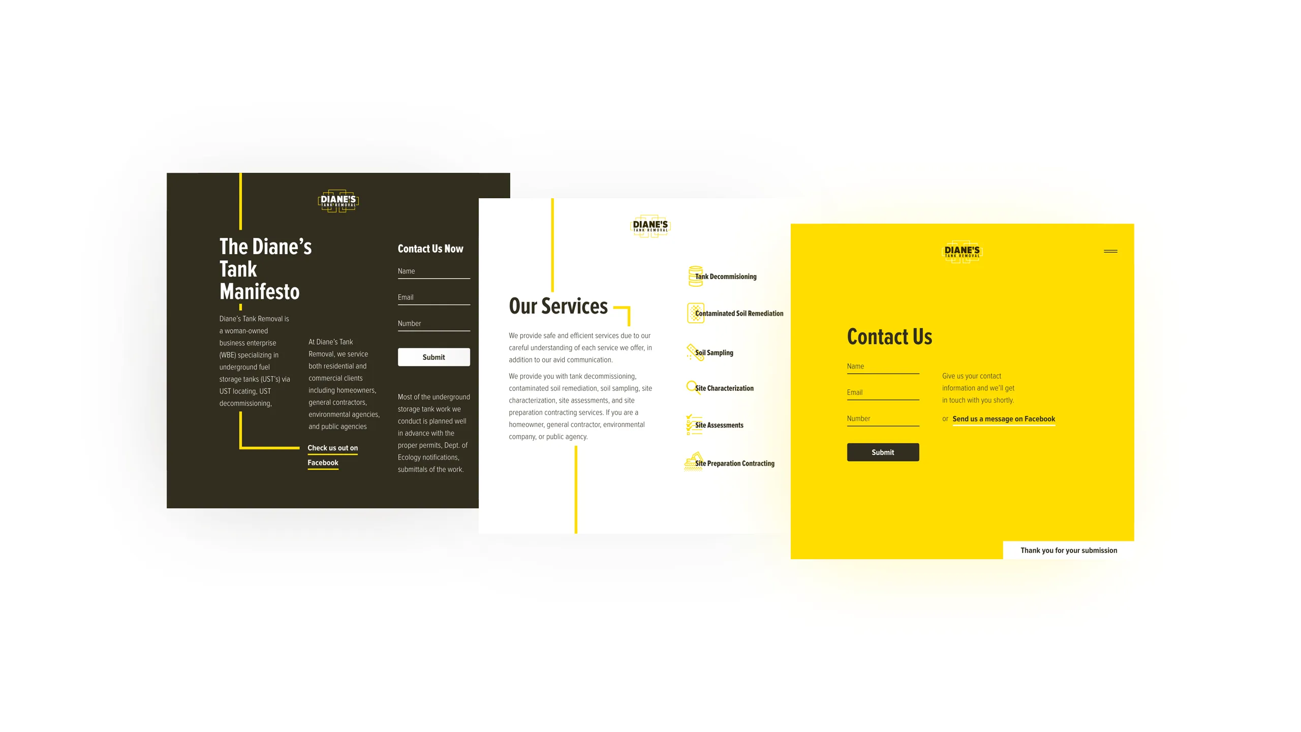
I've been fortunate to have worked as a web designer, a front-end developer, and with various print-based media over the years. These experiences have improved my capabilities as an interaction designer by broadening my perspective of how physical and virtual worlds can interact. Lately, I've been designing experiences and interfaces for the web, but I also enjoy any opportunity to work on branding, identity systems, and physical media. For business inquiries, please feel free to message me or leave me a call.

Two Interfaces: An interface showing a zoomed out view of the vehicle dashboard and details related to a selected switch. Also, an interface showing several highlighted locations on a dashboard, some are valid locations and some are not

Switch & Gauge Dashboard

CHEC's vehicle dashboard tool contains helpful details related to switches and other parts.

Several interfaces: an interactive graphic for pneumatics, a list of logic conflicts to be resolved, a dashboard displaying an illustration and various parameters of a vehicle, and an interactive graphic of electronic module connector

A Comprehensive Solution

Users can edit pneumatics, address conflicts, adjust inventory, and view a module's active pins.

An interface displaying a complex low-code diagram of a vehicle's logic

Editing Logic

Users can create sophisticated logic to operate their vehicle with an intuitive low-code editing tool.

An interface showing a complex interactive diagram for a vehicle's Power Take Off system

Power Take-Off

CHEC offers a one-of-a-kind interactive tool for setting engine and transmission parameters.

20 by 6 grid of custom designed switch graphics

Switch Graphics

Every physical part on a vehicle is represented by a custom designed vector graphic in CHEC.

Sensitive imagery and concepts have been redacted for the benefit of Daimler Truck North America.

Daimler

UX, UI, Illustration, Animation

Daimler Truck North America (DTNA) is a leader in creating vehicles that make up the backbone of the global economy. These vocational vehicles include brands such as Freightliner, Western Star, and Thomas Built Buses. The Custom Hardware and Electronics Configurator (CHEC) allows electrical engineers to quickly upfit their fleet of vehicles with custom logic and hardware.

One of the challenges in designing CHEC was creating a tool that was capable of working with a wide variety of vehicles that each have their own electrical architecture and physical limitations. It was important to build a product that intelligently works within these confines so that engineers can focus on more important tasks.

Regular consultation with users helped to shape an intuitive product that saved customers time, money, and delighted them along the way. Some notable examples include: enabling users to create and edit custom logic rapidly, designing interactive illustrations that visually match what the user sees on their physical vehicle, providing a guided-configuration to demystify a complex task and complete it in just a couple easy steps, and creating an array of animations to ease the pain of CHEC's loading time.


Check out the Daimler case studies

Go to CHEC: Switch & Gauge case study (password required)

CHEC: Switch & Gauge Dashboard

Lock iconPassword Protected
Go to CHEC: conflict resolution case study (password required)

CHEC: Conflict Resolution

Lock iconPassword Protected
Go to CHEC: Power Take-Off case study (password required)

CHEC: Power Take-Off

Lock iconPassword Protected
Interfaces displaying material ordering, lesson plans, games for kids, testimonials, and poison information

Missouri Poison Center's Website

Material ordering, lesson plans, games for kids, poison info, and more are available on the new site.

3 mobile phones displaying interfaces for a poison risk scale, prominent contact information, and free materials for order

The New Mobile Experience

It emphasizes a poison-risk scale, contacting a professional, and ordering materials for educators.

An advertisement for the progressive web app with the text 'Want to take Missouri Poison Center with you?'

MPC's Progressive Web App

The PWA allows users to download the website on any device and use it without internet access.

A grid of images showcasing style guidelines for typography, color, imagery, and more

The Styleguide

The redesign included new style guidelines for typography, color, imagery, iconography, and more.

A poster labeled 'Antidote Chart' listing poisons and treatments

Antidote Chart

A poster was created for Missouri physicians' offices that details various poisons and antidotes.

Missouri Poison Center

UX, UI, Brand System, Print

The Missouri Poison Center plays a pivotal role in safeguarding the health and well-being of individuals across the state. By offering immediate assistance and expert guidance in cases of poisoning emergencies, the center provides invaluable support to both the public and healthcare professionals.

One significant hurdle they faced was users encountering areas with poor or no cell service, particularly in remote locations where poisoning incidents often occur. Additionally information was difficult to find and decipher on the outdated website. A crucial metric for the center's sustained funding relies on users discovering and dialing the center's hotline.

The final product featured a fundamental restructuring of the website's architecture and layout, new iconography and graphics aimed at improving information readability and discoverability, and a progressive web application enabling users to access the website seamlessly from any location, even in areas with limited internet connectivity.

Furthermore, a poster detailing poisons and antidotes for healthcare providers was created, along with a style guide aimed at fostering brand alignment.


Go to Missouri Poison Center case study

Check out the Missouri Poison Center case study

A collection of STC-branded materials including envelopes, a CD, a letterhead, business cards, pencils, and erasers

The Brand Identity System

The proposed redesign of the STC brand included buttons, disk jackets, business cards, and more.

Several interfaces for STC's desktop website

STC's Website Redesign

The new site focuses on STC's products and the positive impact they have with their partners.

Several interfaces for STC's mobile website

Responsive Solutions

All content is designed to provide users with 100% of the experience on mobile and desktop devices.

Two stacks of STC-branded business cards with custom iconography for different roles

Specialized Business Cards

STC's new business cards incorporate illustrations relevant to a particular person's role.

STC-branded envelopes employing brand textures

STC Envelopes

STC-branded envelopes extends the brand's identity with line-art textures on the fold.

STC-branded letterhead and folder

Letterhead

Iconography, color, typography, and illustrations promote STC's new vision in all brand materials.

A 3 by 6 grid of all of STC redesigned logos

The STC Product Suite

STC's comprehensive offering of subsidiary products now benefit from a cohesive visual identity.

6 interfaces for MyIR's mobile native app

MyIR

STC's most ambitious product is a consumer-facing mobile app for accessing immunization records.

STC

Rebranding, Brand System, Print, UI, UX

Scientific Technologies Corporation (STC) is on the front line of the battle against infectious diseases using innovative technology solutions to create a healthier future.

STC was poised to expand the company into a wide variety of different fields with technological innovation beyond health analytics, and needed a brand to reflect their ambitious new vision.

The new logo mark exemplifies sophistication, innovation, and movement; yet remains solid and refined, authoritative and sleek. It utilizes an elegant simplicity that's appropriate for a brand that's well established in its field, but it doesn't limit it to any single scientific discipline or technological direction.

This strategy was attractive for a forward-thinking company like STC. The methodology looks beyond current trends in the industry by adopting a strong typographic approach that communicates an understated confidence. It allows them to grow using a classic, timeless style.

A consumer-facing application and multiple B2B applications were designed to assist health providers and government officials in monitoring vaccination status and addressing immunization gaps among patients.


Go to STC Product Suite

Check out the STC case study

A 4 by 3 grid of various logos I've created

Logo Marks

I strive to create meaningful concepts that represent a brand's unique identity and values.

Other Orb Logo
All ADAS Logo
Diane's Tank Removal Logo
Bearden Logo
Personal Brand Logo
STC Logo
Kirby Pam Mary Hamway Logo
Daely Pentico Racing Logo
nu.world Logo
Northern Arizona Archery Team Logo
New Dawn Investments Logo
Cardhouse Application Logo

Logo Marks

Branding, Brand System, Logo

The above marks are a collection of logos created for work and personal projects.

A zoomed-in microchip on a motherboard with neon red and blue connectors

Brand Imagery

The new SigmaSense homepage's hero image evokes the brand's power and dimensionality.

An interface showing text 'Introducing the next evolution in machine sensing solutions.' and colorized images side by side

Content Blocking

Information on the new website is divided into discrete sections for easier reading.

An interface with text 'SigmaHover™ technology makes touch interactions optional. Touchless.' and a dramatic microchip background image

Calls-to-Action

Vivid and eye-catching full-width imagery focuses the viewer toward important CTAs.

A 4-column grid of colorized touch screen images

SigmaSense Color System

Images on the website follows a more consistent brand color story than in previous designs.

An interface using a 3-column grid of cards with images and content about SigmaSense's products

Responsive Grid

The redesign's mobile-first approach ensured that content was accessible on all devices.

SigmaSense

Brand System, UI, UX

SigmaSense, known for creating the industry's most advanced hover and touch-screen technology, needed a new website and brand strategy to reflect their innovative products. At Northwest Media Collective, we revamped their inconsistent color scheme, typography, and information architecture to align more closely with user expectations.

Neon blues and reds were leveraged with stock imagery and typography to emphasize the powerful and dynamic nature of the 3D touch technology. Additionally, we streamlined the website, making it easier for users to find information about SigmaSense's products and contact a representative.

Diane's Tank Removal Animations

Animated lines follow the user to further illustrate Diane's personal and meticulous approach.

3 interfaces displaying an about page, services page, and contact page

Story, Services, and Contact

Iconography, typography and other UI elements create a cohesive brand story.

Image displaying a page of Diane's Tank Removal brand guidelines

Brand Guidelines

Diane's new rebrand came with thorough guidelines for consistent print and digital strategy.

Diane's Tank Removal

Branding, Development, UI, UX

Diane's Tank Removal is a woman-owned business enterprise (WBE) specializing in underground fuel storage tanks. It was important to Diane that the company maintains it's commitment to thorough and well-thought plans that preclude all operations and that the logo reflects those values. The mark utilizes lines reminiscent of a schematic. It demonstrates a professional authority to the work that customers know Diane brings.

The website carries the underlying concept behind the brand design by leading the user through each "step" of what makes Diane's Tank Removal special. Animation enhances the experience by emphasizing the systematic approach of Diane's Tank Removal.

An interface of Daely Pentico's home page featuring futuristic UI elements

Daely Pentico Racing

The new landing page showcases Penticos's buggy racing skills and futuristic dashboard UI elements.

An interface of Daely Pentico's race schedule on the website

Event Calendar

The race schedule's design draws from old-school race materials but with modern typography.

An interface of the mobile navigation of the website

Mobile Design

Daely Pentico's website offers the same dynamic experience both on desktop and mobile devices.

Daely Pentico Racing

Rebranding, Development, UI, UX

Daely's race record speaks for itself: Over 60 Amateur Podiums, 2 Class Championships and 5 different “Rookie Of The Year” awards. Unfortunately, his old logo and website couldn't keep up with his excellent career. With the brand redesign, the logo demonstrates speed and power with a sleek, geometric design.

The new website incorporates a stunning background video on the landing page that shows off Daely's racing skills along with imagery similar to that seen on a car's dash console.

A collection of Other Orb-branded materials including business cards, letterhead, and website

Other Orb's Brand System

The brand's striking imagery extends to letterheads, business cards, pens, and more.

An array of red and white business cards for Other Orb

Business Cards

Other Orb's cards have two color variants and room for preferred pronouns and other information.

Other Orb

Branding, Brand System, Print

Other Orb is dedicated to conveying the wonders of the universe and envisioning a more inclusive world on Earth. However, their previous brand identity fell short of this ambitious vision. To better align with their goals, they requested a complete rebranding, which included a new logo and updated materials such as business cards and letterheads.

The new concept embodies the three core aspects of Other Orb's mission: science, exploration, and inclusivity. These elements are represented by interconnected spheres, symbolizing togetherness, cooperation, and the dynamic nature of the brand.

The design features a geometric and mathematically gridded structure, bright colors, and a subtle Moiré effect, reflecting a brand that is both scientifically oriented and engaging. The rounded typographic ligatures add a welcoming touch to the logomark. Other Orb was thrilled with the new brand direction and appreciated the thoughtful consideration that went into the concepts and materials.

An image of the front and back cover of the redesigned Musashi. The cover shows a silhouette of a couple structures, a tree, and figure climbing a mountain

Book Cover

The cover captures the novel's metaphorical journey through a harsh and unforgiving landscape.

A 2-page spread within Musashi showcasing an illustration of a feudal era Japanese castle

Title Spread

Different styles of illustration are used throughout the novel that mimic Musashi's shifting state.

A collection of images of 8 section pages including illustrations related to each title

Section Pages

Each "Book" of the story is themed to an element and utilizes imagery from ancient Japanese artwork.

A close-up image of 'Book 1' of the novel with an illustration of rocks and calligraphic typography

Section Close-Up

Illustrations are relevant to the Book's motif and are paired with calligraphic typography.

2 full-spreads of chapter pages in Musashi

Chapter Spread

Body spreads have significant breathing room for inside margins and mixed-language folios.

Musashi

Publication, Print, Illustration, Concept

Musashi is a classic Japanese novel by Eiji Yoshikawa set during the feudal era about the most renowned swordsman in the land, Myamoto Musashi. Given the popularity of the book, it was important to keep the design conceptually significant to the story to justify a redesign.

The novel is about love, deceit, loneliness, honor, and violence. These elements were incorporated in and throughout the book by utilizing minimalist layouts and stark contrasting imagery. The design choices are a reflection of the themes of the novel and are meant to enhance the reader's experience more than the first-edition novel had through contextually significant illustrations throughout the book and japanese calligraphy to accompany the English text.

3 Android devices showcasing interfaces for Austin 360's mobile app including filters, custom events, and search

Austin 360 on Android

The interface uses bright colors that match Austin 360's exuberant and fun product.

An iPhone showcasing the iOS version of the search filters interface

Cross-Platform Experience

Different devices required tailored UX decisions for segmented controls, buttons, and other items.

Austin 360

Mobile App, iOS, Android, UI, UX

Austin 360 is an Austin, Texas based company that offers a guide featuring music, event listing, and area recreational activities. Austin 360 wanted to make it easy for their target audience to not only find events, but host their own.

They commissioned us at WeAreWilliam in Flagstaff, AZ to create an app that incorporated these tasks with the user experience in mind. In collaboration with Tommy and Danielle O' Connor, it began with detailed wireframing of user flows before creating a cross-platform design that was fresh but also familiar to the user based on their device.

A zoomed-in shot of the Email Guidebook's cover

Email Guidebook

The book cover and inside pages employ a minimalistic approach that focuses on priority content.

A 2-page spread detailing email-safe typefaces and proper treatment

Email Typography

Email clients do not have broad support for many fonts and require proper contrast for accessibility.

A 2-page spread of organizing and managing Photoshop files

Design Best Practices

Designing in an organized manner can help to reduce friction in the handoff of assets with developers.

A 2-page spread extolling the benefits of Smart Objects while designing in Photoshop

Using Design Tools

The Email Guidebook offers instructions for aligning to a grid and reusing components.

Email Guidebook

Email, Print, Presentation, UX

Deckers Brands sends out millions of emails to subscribed users every month. For this reason, it was critical to make sure users were given an optimal experience. Ensuring a good experience is time consuming and requires extensive communication between designers and developers.

The Email Guidebook serves as a companion for designers and developers alike, a reference of easily digestible information in the form of minimalist graphics and typography. It includes contemporary email best practices and general work-flow advice.

Back to Top